Developing a design strategy
The church has several main areas of focus that represent the majority of the design support I provided:
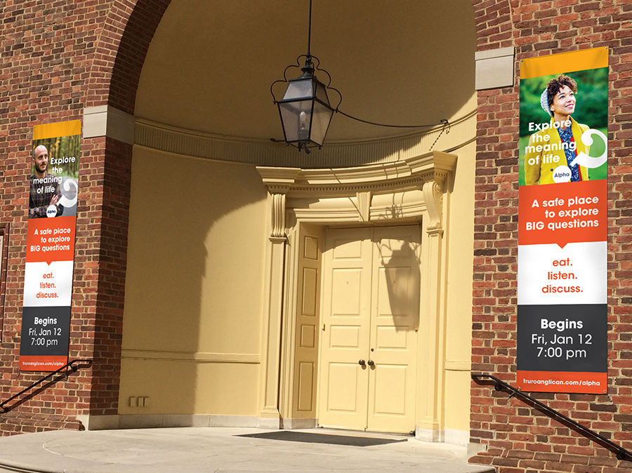
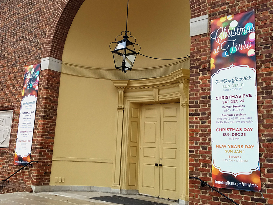
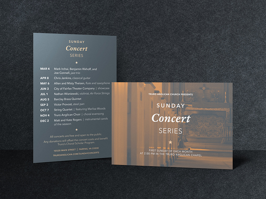
- events, especially the major holidays of Easter and Christmas
- the Alpha program, which is an outreach class they host three times each year
- the family ministry and international ministry department events and outreach
- the website
Events typically require postcards or flyers that get distributed each Sunday at the church and sometimes in the surrounding community. I also created a set of graphics for promoting the event on their website, and major events also get banners and other signage that are put up around the church campus. Since most events occur one or more times per year, I developed templates for many of the pieces, which allow the date-based content and photos to be updated, but keep the designs consistent and on-brand. This allows for quicker turn-around on designs, and creates time for more custom designs to be created for those non-annual, one-off events and occasions.
Consistency is key
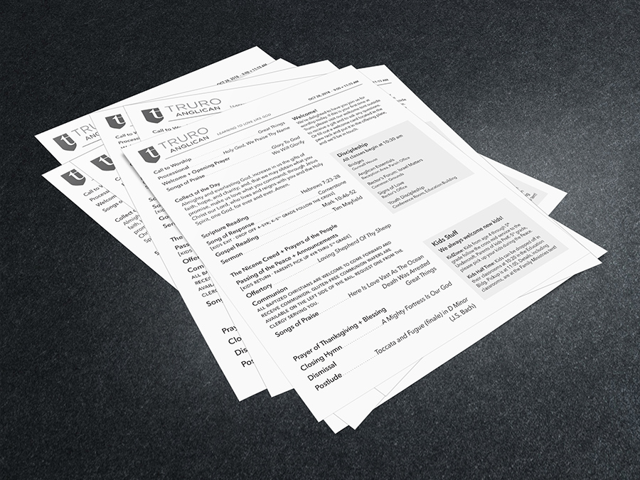
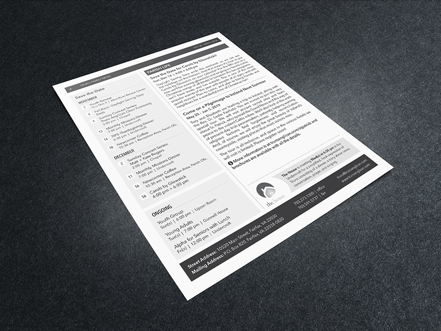
Their Sunday morning worship guide is combined with a church newsletter and printed and distributed at each of their four services. When I first came on board, there was no consistent design to the newsletter beyond a header and some columns for articles, and the overall document was anywhere from 12 to 18 pages long. Working with the director of worship and director of communications, I created a layout template and a guide for using consistent fonts and styles, which allows for some flexibility in terms of word count for articles but keeps the entire document to four pages each week.

