
Metro Ridership Downturn in Recent Years
Metro’s rail system has grown substantially from a daily ridership of 103,000 in 1977 to 723,000 in 2007. In recent years, however, Metro has had ups and downs, with several safety incidents and lack of regular maintenance on an aging system causing a significant downturn in ridership. This is despite the Silver Line expansion in 2014. Much of the drop can be attributed to the year-long maintenance initiative SafeTrack in 2016–17.
The addition of the new 7000-series cars, which have fewer maintenance issues, and removal of older-series cars, as well as continued system repairs in the past year bode well. It remains to be seen whether this will improve performance enough to coax riders back riding Metro.
The graph below shows the average weekly passenger boardings for each year, broken down by metrorail station.
Average Weekly Passenger Boardings
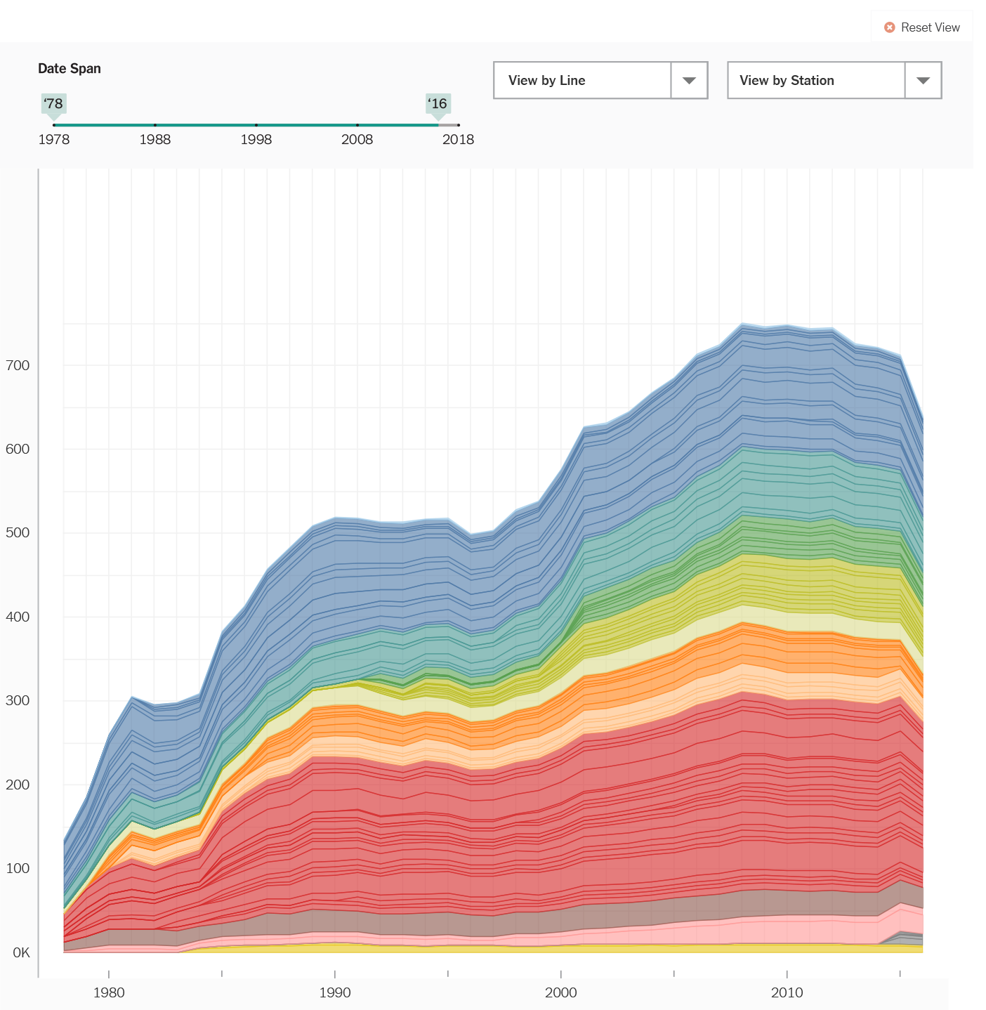
Default view shows full year span (1978 – 2016), all stations, grouped by color by stations. Points along lines in graph area are clickable.Dates indicators are slidable on the date span slider. Graph area refreshes once a new start or end date is chosen. Slider has a minimum of 1-year span; max is the default.The view can be reset to default by clicking on “Reset View” in the upper right.
Average Weekly Passenger Boardings
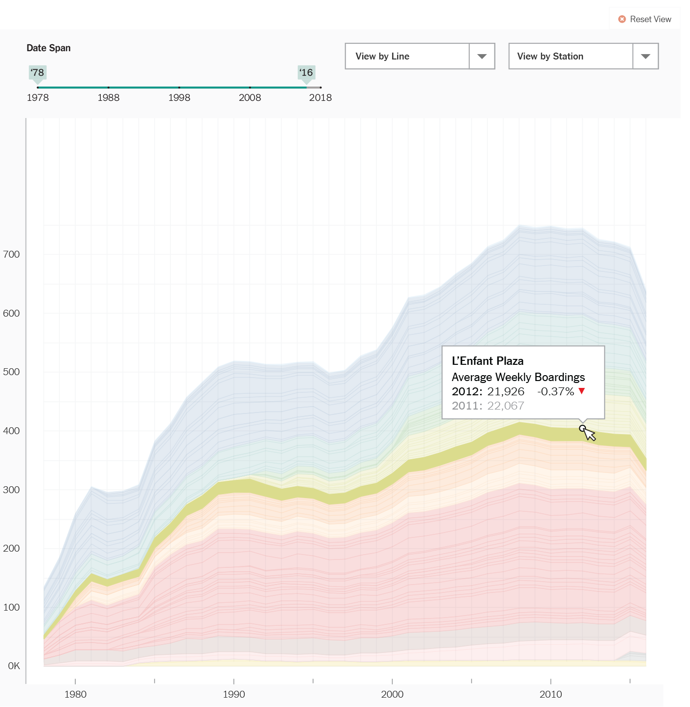
Clicking on a point in the graph area will show a popup with data about that point.It will automatically highlight the Station associated with the point. e.g. In the above view, the L’Enfant Plaza area of the graph is highlighted and a popup for 2012 shows at the data point that was clicked. The other data on the graph will be dimmed by 50%.
Average Weekly Passenger Boardings

Clicking on an area in the graph will highlight that Station on the graph.
Hovering over points or areas on the graph will show the name of the Station overlayed.
Average Weekly Passenger Boardings

Choosing a Station or multiple Stations from the dropdown will repopulate the viewing area with data related to the Station(s) chosen. The y-axis scale will change so that each Station on the graph is more easily viewed.
Labels showing the name of each station will appear by default on top of the graph.
Average Weekly Passenger Boardings
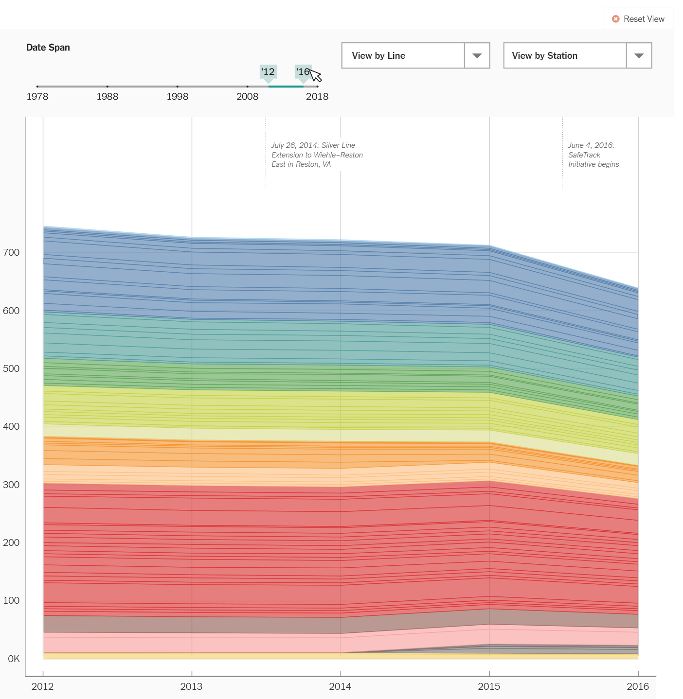
Choosing a span of years will refresh the graph to show just those years. The same interactivity described previously regarding clicking on the graph also applies to this view.
Average Weekly Passenger Boardings
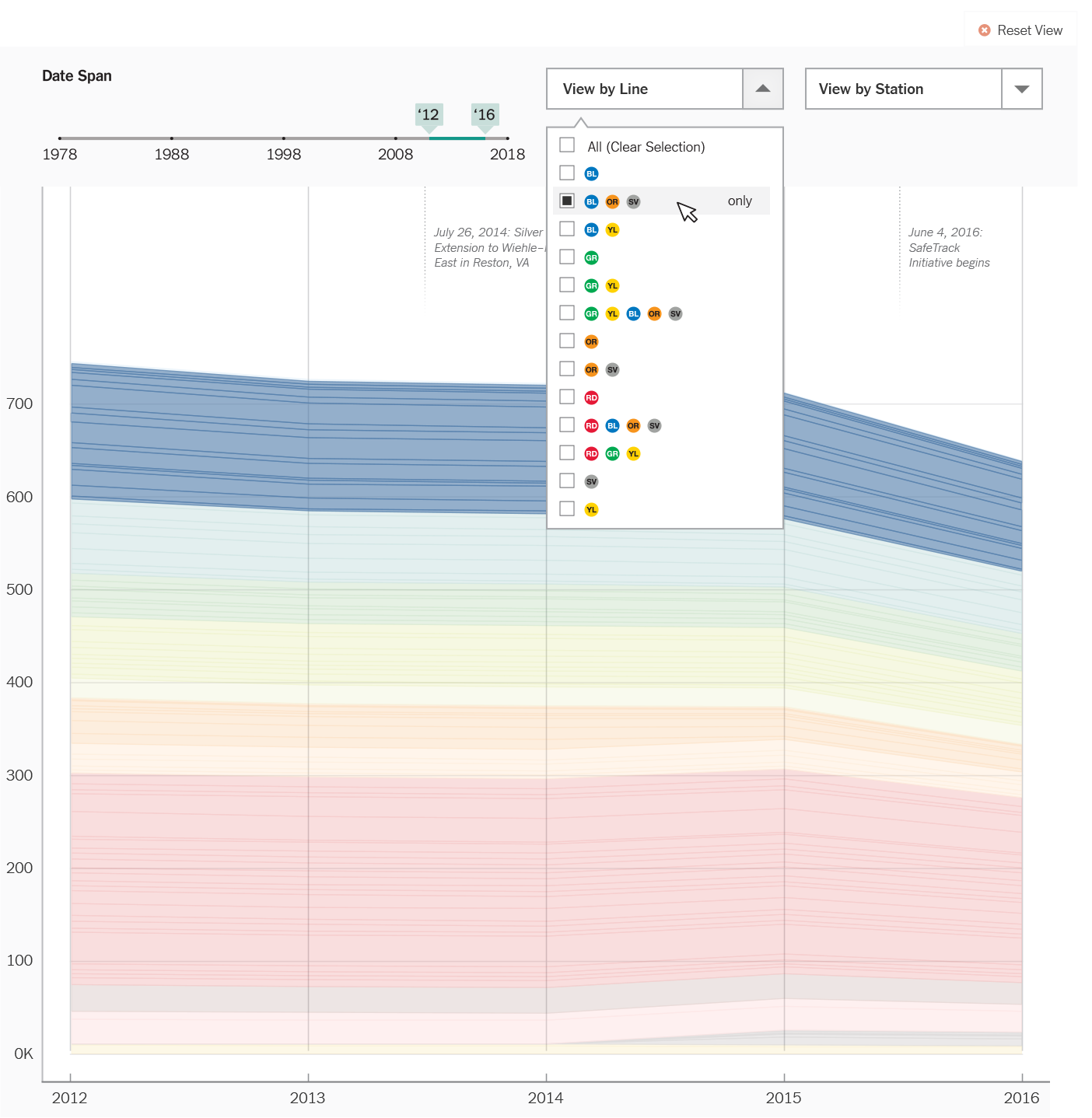
Choosing from the Line dropdown will highlight the stations associated with that Line.
Average Weekly Passenger Boardings

Once chosen, the graph view will refresh and display data regarding that line (or seelcted group of stations) in an info box in the upper right.
Average Weekly Passenger Boardings
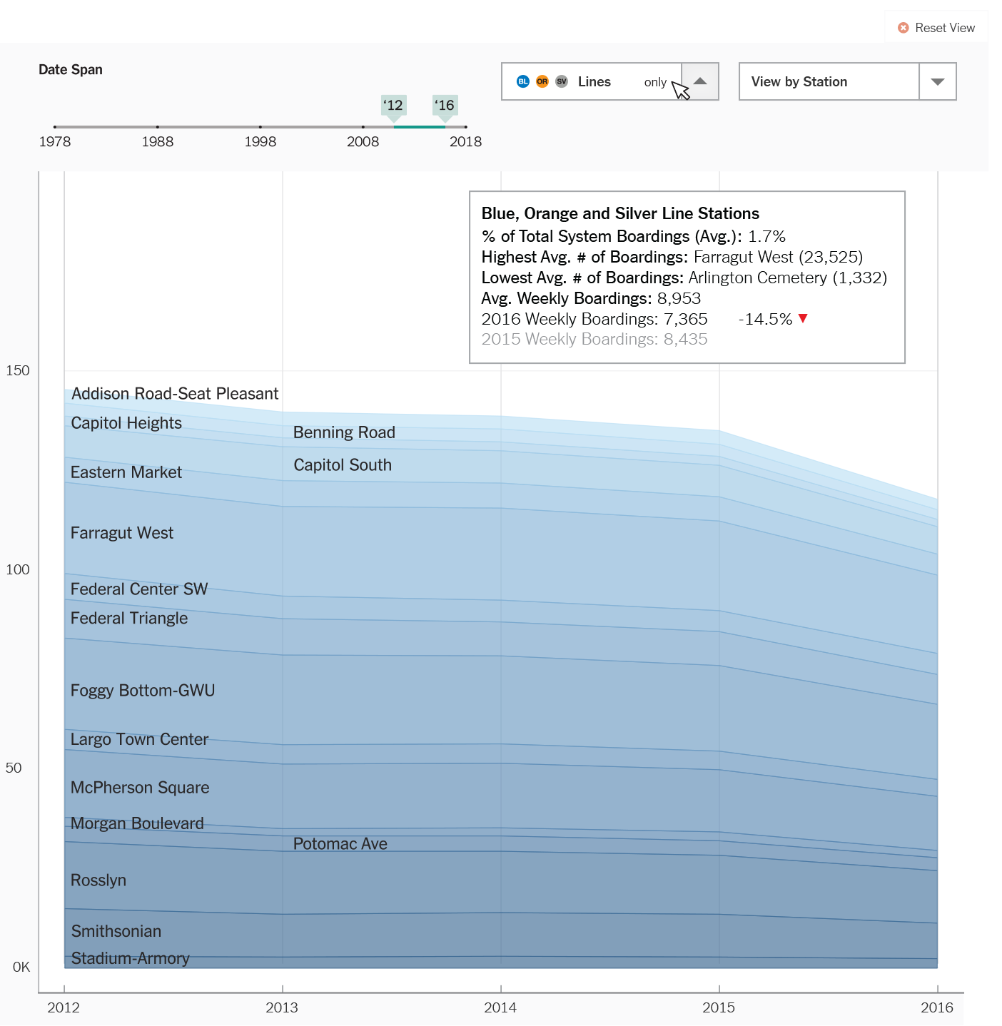
Clicking on the “only” label within the Line dropdown will repopulate the viewing area with data only related to that Line. The y-axis scale will change so that the areas for each Station on the graph is more easily viewed.
Labels showing the name of each station will appear by default on top of the graph.
An info box about the Line (grouping of stations) will appear at the top right.
VIEW GRAPHIC AS SLIDESHOW BELOW
