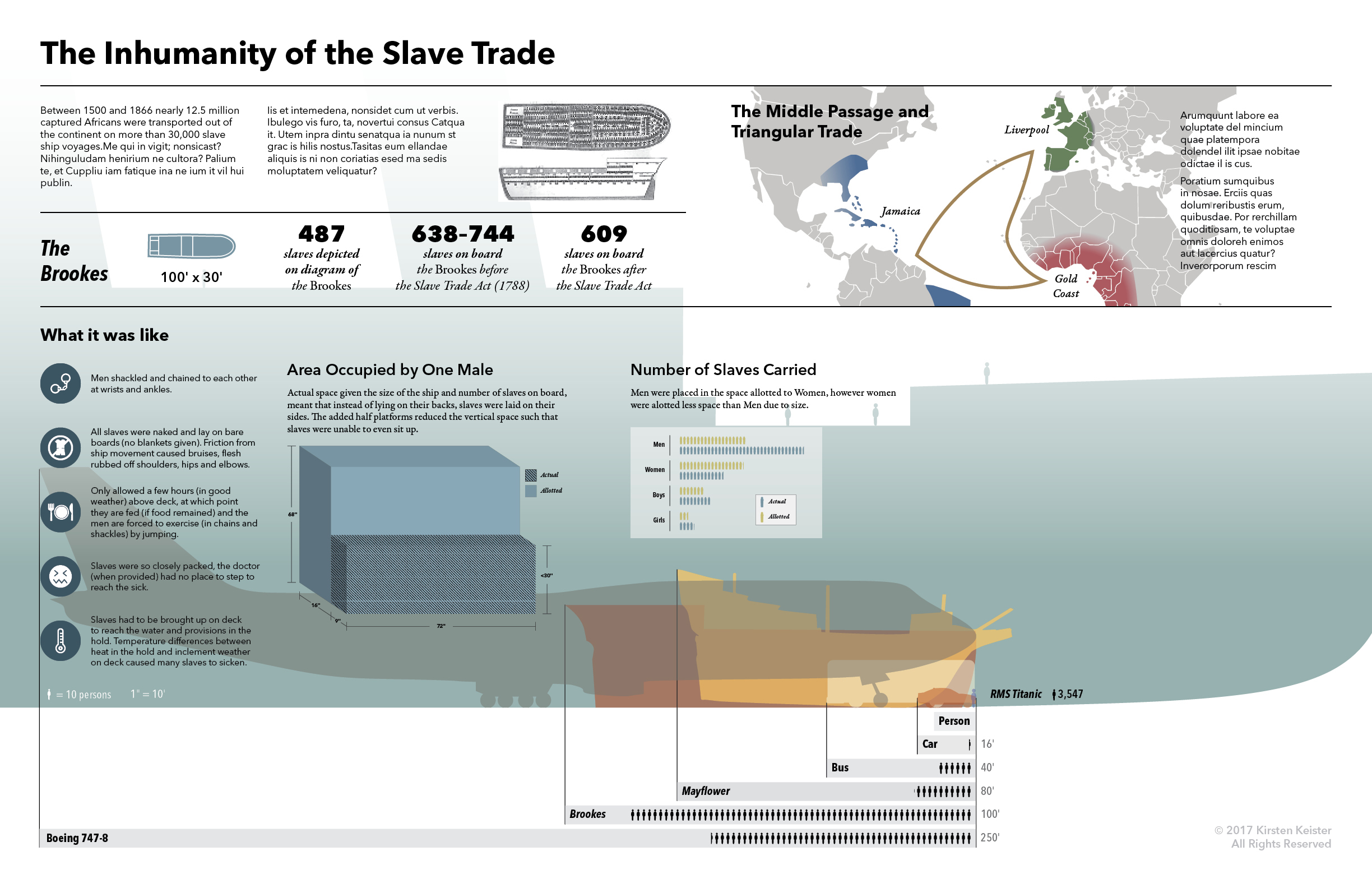
The goal of this project was to take an example visualization produced before 1900, and reorganize the information from the historic visualization according to present scientific, cultural perspectives and present it in a contemporary design context.
PRE-1900 VISUALIZATION
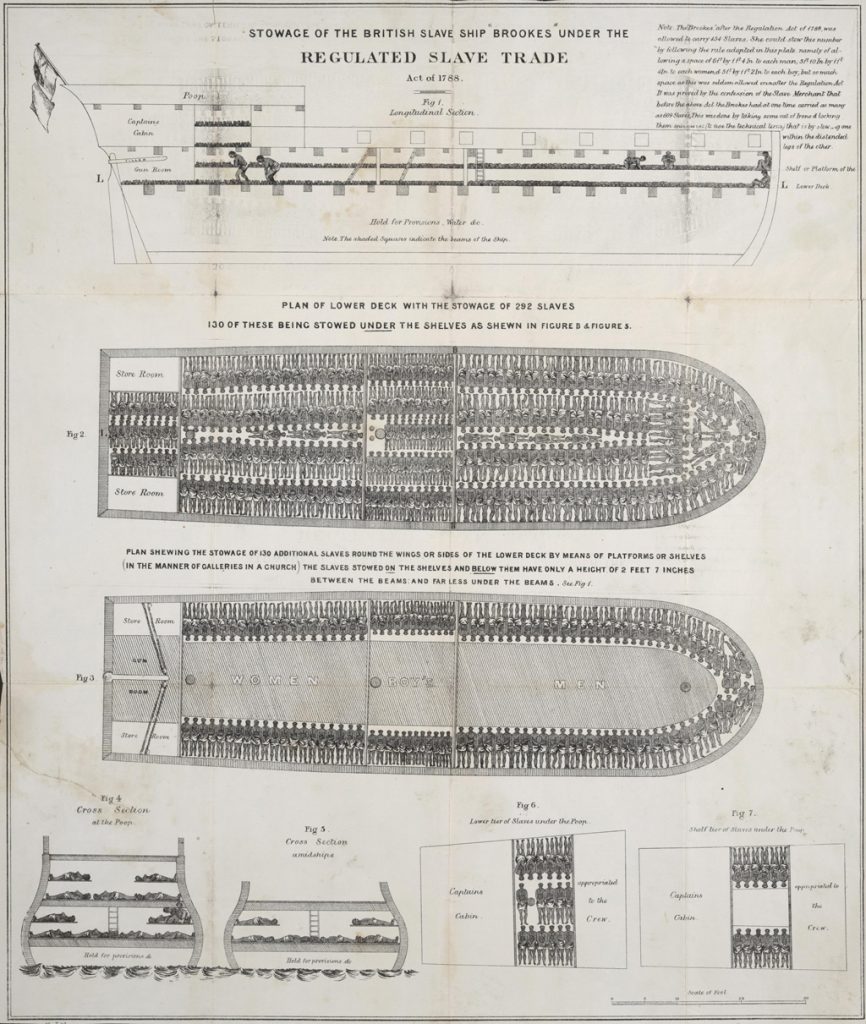
William Alfred’s diagram was used to describe conditions on board slave ships in England and it was adopted by abolitionists worldwide as evidence of the barbaric nature of the slave trade.
It was created to show the stowage that was allowed under the Slave Trade Act of 1788, that of 487 slaves. The diagram does not depict the reality, however, as noted in the upper right of the poster (left), the journey before the measurements were taken there were actually 638 slaves on board. The following journey had 744 slaves on board. The first journey after the measurements were taken, 609 slaves were on board. The note also explains how, before the Act, they managed to fit so many more slaves by stowing “one within the distended legs of another.” There are other inaccuracies in the image with regard to hull thickness, lack of deck hatches, etc.
In actuality, the conditions were much, much worse than depicted by this visualization, and yet its publication and re-publication worldwide seem to indicate it had some measure of success for the abolitionists’ cause.
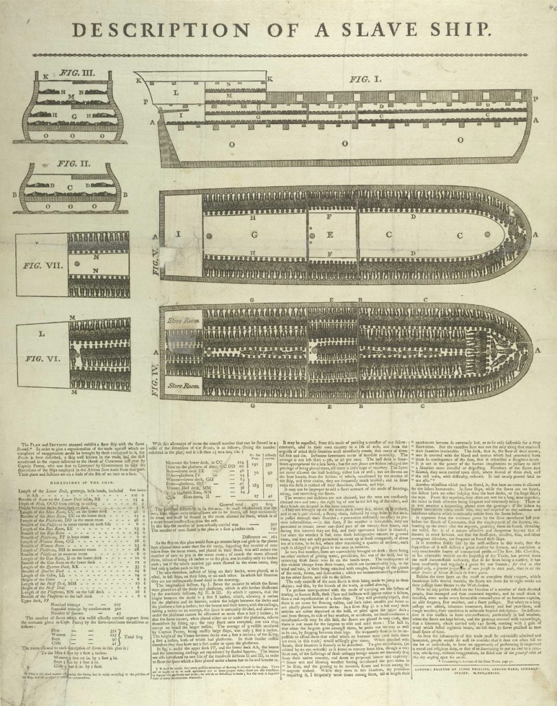
The diagram was added to a poster with text describing the conditions in more detail. It conveys the facts and eyewitness testimony without much judgement or bias.
The technology of the time for visuals was typically some kind of engraving or etching, which could then be printed up alongside type.


